
Bet you never knew that fonts had “moods”. Or that some fonts are “dominant”. These are only some of the fascinating tidbits of knowledge designers use when creating the best font combinations.
Choosing the perfect font can be one of the biggest time drains for designers. There’s so much on the line: your font has to support an artistic theme, represent a brand, be easy to read, and more.
That’s why choosing font combinations are even more frustrating. Once you’ve chosen your initial font, you have to run through the process all over again to find the perfect complement.
That’s because, as you probably well know, what works for headers and pull-out boxes doesn’t always work for the text your viewers will be reading. Plus, to create visual interest and to properly organize the information on the page, you’ll need more than one font.
Adobe Typekit and Google Fonts are two resources worth perusing. But don’t be surprised if you spend hours looking over all the impressive fonts. View our Google Font samples here.
Learn the Rules, Then Get Creative
Without a few ground rules to guide you, it’s easy to spend far too many hours combining fonts and still be unhappy with the results you get. For that reason, it’s helpful – no, absolutely necessary – to study up before going into such a project.
As every creative type knows, the first step in producing great work is to learn the rules. Once you’ve mastered the basics, then and only then can you start to branch out and get truly creative, perhaps even breaking those rules to create truly ground-breaking designs.
So with all that in mind, here’s a basic tutorial to show you the way.
Step-by-Step Tutorial for Finding the Best Font Combinations
Step #1. Determine the mood of your project.
Are you shooting for an elegant look? Or do you want the finished product to have a playful vibe? Before you dive into font choices, take a few moments to define the mood of your project. Then, with a few descriptive words placed firmly at the forefront of your mind, you’ll be able to sift through your options faster.
Fonts come in as many moods as you can dream up:
- exuberant
- respectable
- tough
- sweet
- cheeky
- debonair
- lyrical
- hearty
Your main font – some call it the “display font” – is used for larger elements in your design such as headers or even a logo. As such, it’s dominant and sets the mood for your project.
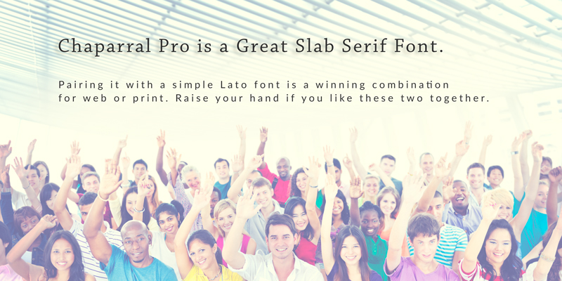
Slab serif fonts are known as dominant fonts, so you may find that your display font is, more often than not, a slab serif. Keep that in mind for Step #2.
Step #2: Balance Out the Display Font
For a secondary font, you’ll want to keep in mind that opposites attract. If your display font is blocky, bold and full of right angles, a font that conveys a lighter touch will be a nice complement. If your display font is a slab serif font, don’t choose another slab serif to pair it with.
In fact, if your font combo consists of two fonts that look similar, it’s just going to look like a mistake. It might look as if you were cutting and pasting from different sources and didn’t notice that your fonts weren’t matching up.
For example, if your display font is sans-serif and minimalist, don’t pair it with a similarly reserved, neutral font. Choose something fancier, bolder, zanier, or extroverted. In other words, don’t pair Arial with Tahoma. They’re both sans-serif and very neutral.
Likewise, the best font combinations will balance out the weights of the various fonts. Mix heavy-weight fonts (bold) with normal-weight fonts.
Step #3: Try Assigning a “Job” for Each Font
Combining fonts is a lot easier if you assign roles to the fonts you’re choosing. For example, use your display font for top-level headings only, reserving your secondary font for smaller headings and annotations. Finally, use your tertiary font for text.
That way, you bring a sense of organization and hierarchy to your page that’s wonderfully easy on the eye.
A Final Word on Font Combos
Keep in mind that although we’ve given you a set of rules for combining fonts, the process is actually a blend of art and science. But starting with the hard-fast rules will give you a solid foundation for developing your creative side- and then you’ll be on your way to mastering the “art” of creating the best font combinations ever.